We’ve all heard it a thousand times – they don’t make ’em like they used to. Sometimes, that’s for good reason, but there is a certain build quality to electronics of the mid-20th century that is hard to find in hardware today. This inspires great nostalgia and dedication in some, like [Michael Park], who set out to build a calculator reminiscent of the best HP designs from yesteryear.

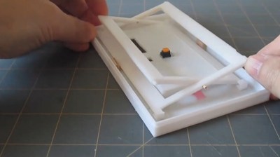
One of the major factors for [Michael] was the great feel of the keys on these classic units. Wanting to experiment with different layouts without a lot of rewiring, the idea of keys with individual displays became attractive. Existing parts on the market were prohibitively expensive, however. Instead, [Michael] used a single touchscreen with a switch mounted underneath to provide tactile feedback with a nifty scissor-arm guide mechanism. Combined with individual see-through plastic overlays, the MP-29 has a fully reconfigurable pad of 30 keys with dynamically updatable labels.
It’s a creative choice, and one that looks highly satisfying to use. It has all the tactile benefits of individual keys, both in the keypresses and being able to navigate the keypad without looking. Combined with the benefit of reconfigurable keys thanks to the touch screen underneath, it’s a great way to build a user-interface.
The rest of the calculator design closely mimics the HP-29, though [Michael] is also experimenting with alternative layouts too. There are plenty of religious wars in the calculator community over usability, after all – mostly over which side of the pad has the arithmetic functions.
We’ve lamented the demise of the standalone calculator recently; with so many smart devices around, it’s hard to see it making a major comeback anytime soon. Of course, if you’re opinionated on the topic, sound off in the comments below. Video after the break.
No comments:
Post a Comment